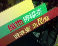
Recently, Vita has changed the market scheme toward the trendy young people. The product packaging looks refresh, bright and simple. Here are the large sticker ads in the MTR train.





For details, please visit the link as below.
http://singpao.com/20061116/feature/886724.html
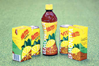
Left hand side is the original packaging. The right is the new one. The color scheme remains to be Yellow, Green and brown with Bilingual descriptions and wavy lines, which helps to define the tea is in motion.
Photo credit: Sing Pao Daily Newspaper
No comments:
Post a Comment